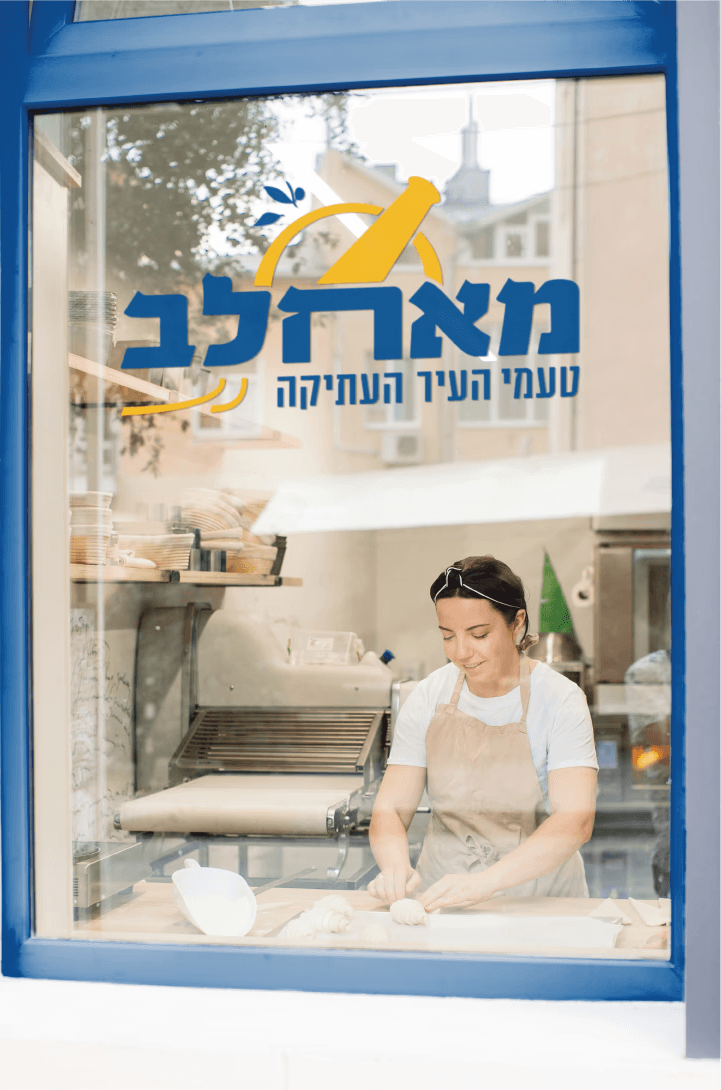
To reflect the deli’s cultural roots, the brand’s typography and logo draw from Jerusalem’s visual language. The font was inspired by ceramic street signs found on old city walls, featuring hand-drawn Jewish serif lettering.
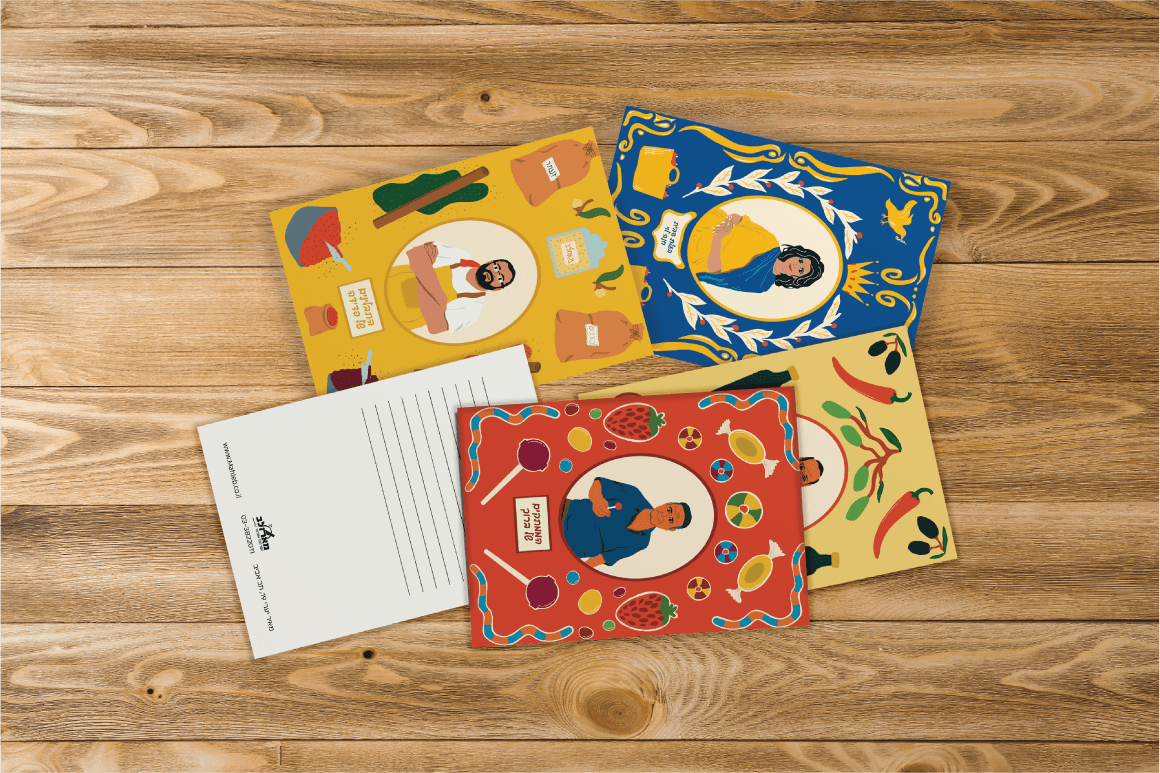
During the logo design process, several symbols were explored - including a traditional female figure, a Jerusalem bagel, a vendor’s cart, a crown of vine leaves, and a mortar and pestle - all aiming to convey heritage and warmth.
The final symbol chosen was the mortar and pestle, representing both the Halaby culinary tradition and the deli’s fresh, handmade approach. It’s accompanied by leaves and seeds from the mahleb tree — a spice common in Syrian cuisine - adding a personal and cultural touch.
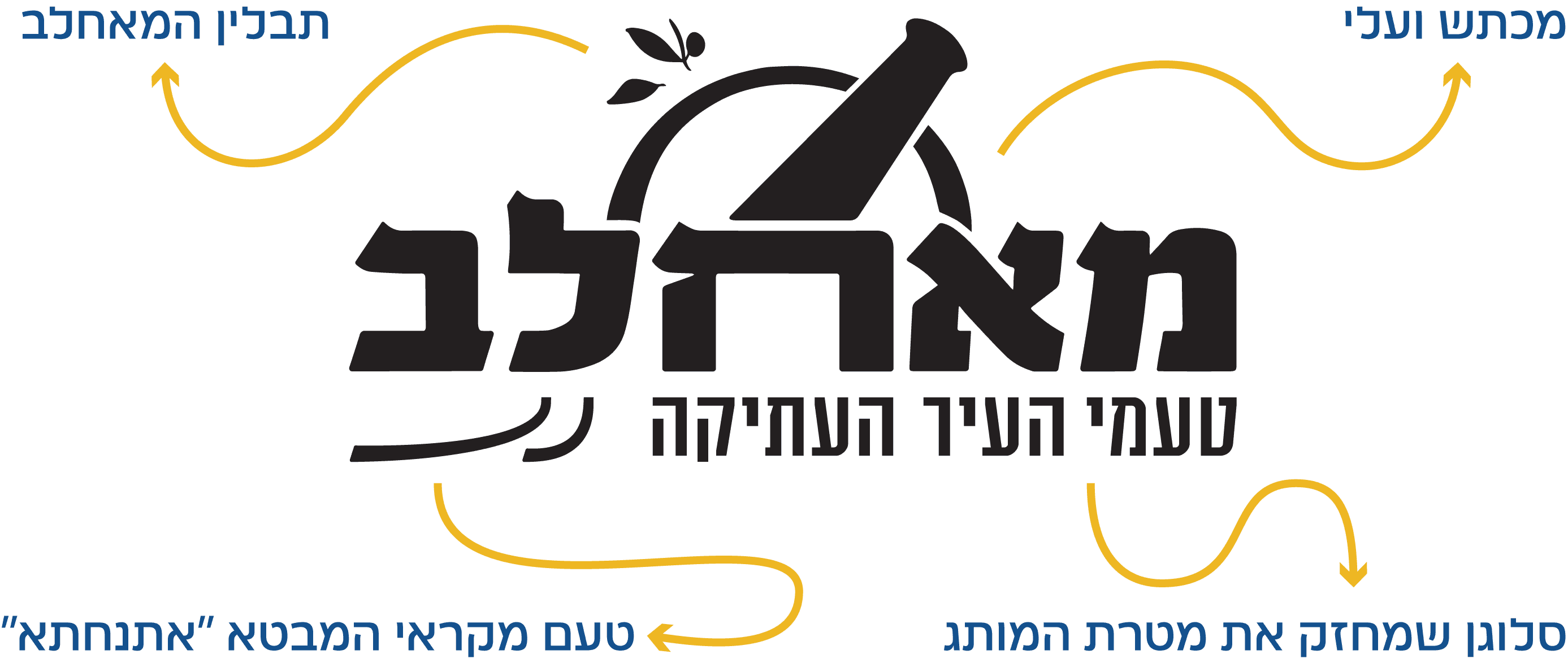
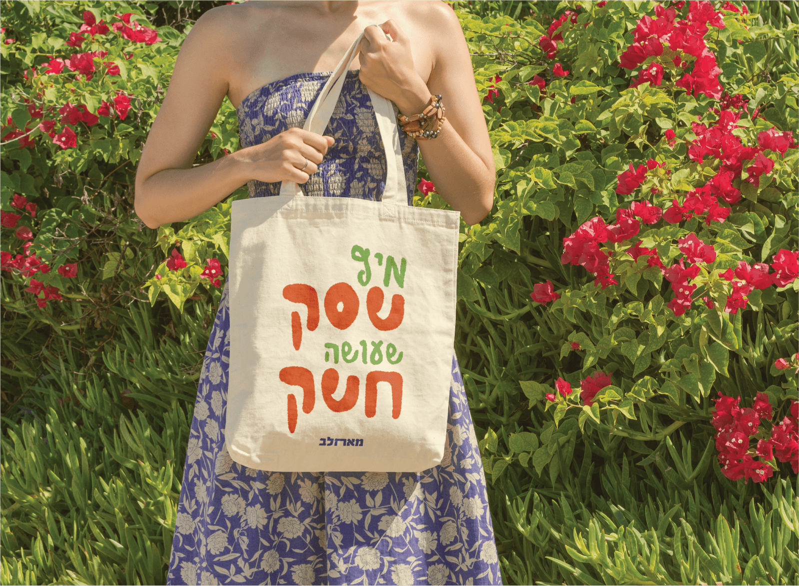
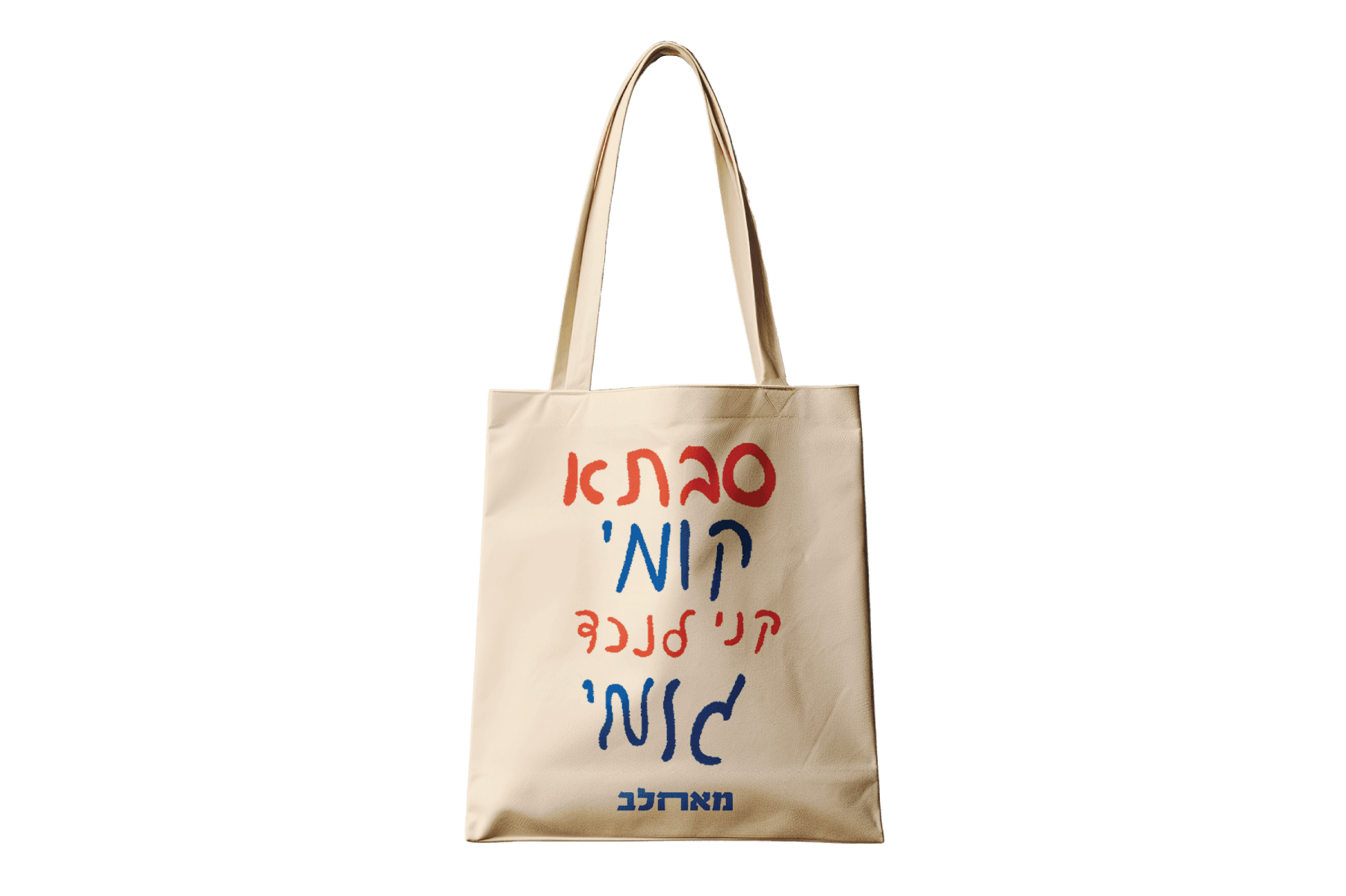
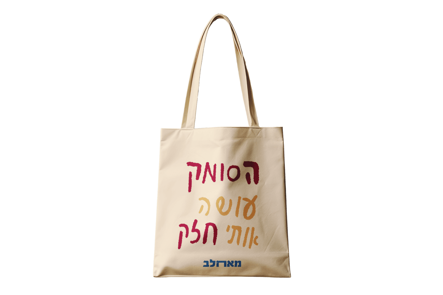
The brand’s design language draws colorful and conceptual inspiration from Jerusalem and its market, aiming to evoke a sense of authenticity and tradition.
The color palette reflects the city: warm yellow for its stone buildings, and blue for the ceramic street signs.
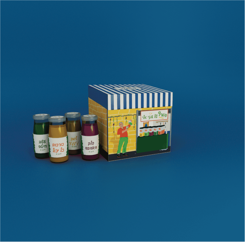
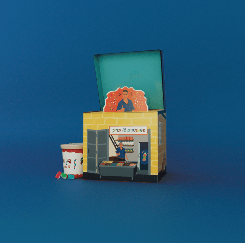
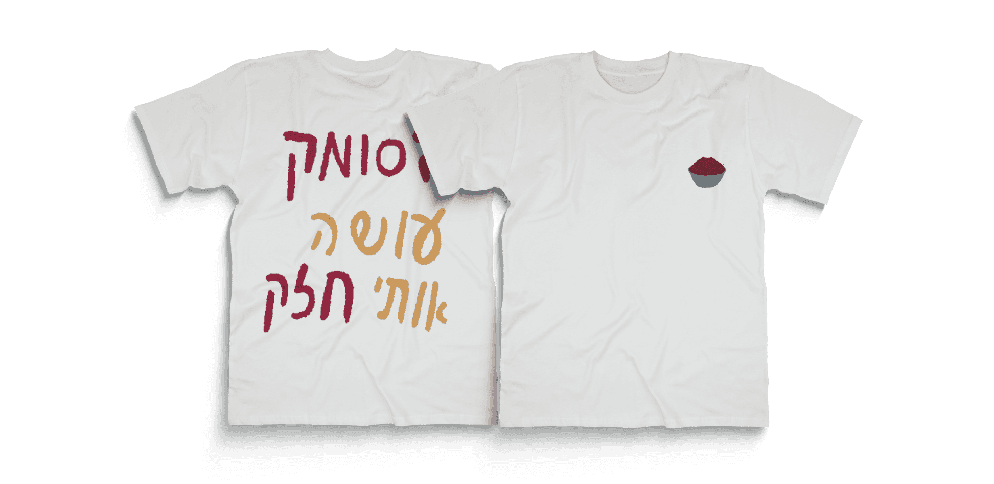
Illustrations play a key role, focusing on the people and stories behind the products. They’re drawn with rough, expressive brushstrokes to preserve a handmade, honest, and down-to-earth feel — in line with the brand’s values.
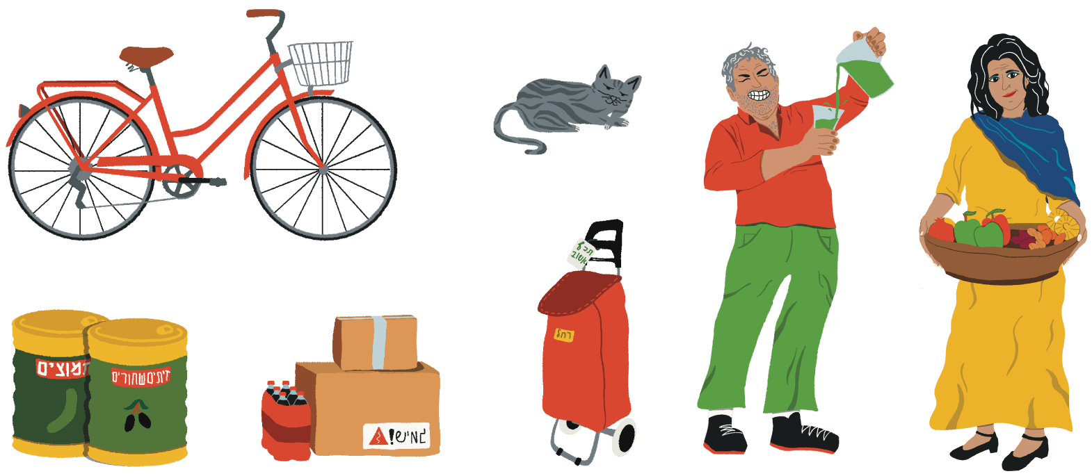


Each package features a unique illustration inspired by the original stall and seller, with a pop-up character and a short audio clip — authentic sounds I personally recorded in Jerusalem’s market, including voices and statements from the sellers themselves.
Inside, the products are designed to reflect the unique look and feel of each stall.